


Color is the amount of light reflected or refracted from an object. Moreover, color is one of the elements of design. And, whenever it is used, it has to be utilized correctly. It can make or break a layout.
If used correctly, they can land a long-lasting impression, but if not, they can convey the wrong message and confuse the observer which is a nightmare for any designer.
In this post, Egor Gajduk, a designer with expertise in UI/UX from Ukraine shows us the power of color in your design.
His words
Color invades every aspect of our lives. Every day we encounter colors that make us happy and colors we are indifferent to. Color creates ideas and sparks interest. Also, color is a powerful tool in UI design. Knowing a little about how colors affect us emotionally can help you achieve your design noticed and positively connect with the potential audience.
⠀
The selection of the right colors can give a good impression and it can even make your design emerge as a remarkable work. It is important that the UI designer has a basic understanding of color philosophy. Remember! Choosing colors for a website or app is not about your color preferences.
Every color can tell a story.
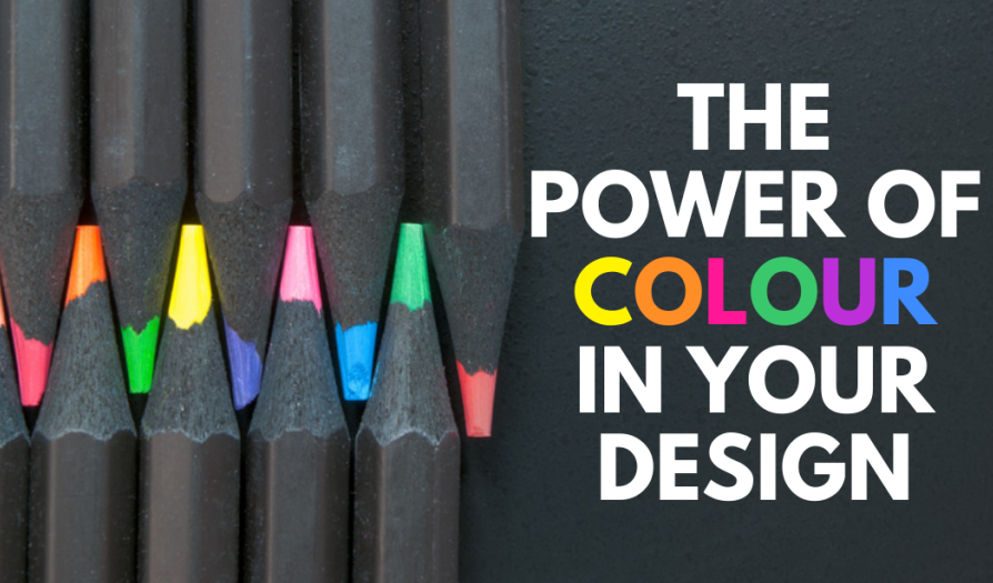
1. The Power Of Color In Your Design

2. Every Color Can Tell A Story

3. Yellow Color
The yellow color is associated with happiness, warmth and energy, optimism, and creativity. It is also the most visible color of the spectrum.

4. Red Color
The red color is associated with energy, danger, strength, desire, and love. It captures attention and also makes a person make a quick decision as it gives a feeling of urgency.

5. Green Color
The green color is associated with nature. It can represent a new beginning, growth, and hope. It also has a balancing and harmonizing effect.

6. Blue Color
The blue color is associated with the sky, depth, stability, loyalty, cleanliness, and understanding. It is sharply refracted by the eyes. Light blues are often relaxed and calming.
Bright blues can be energizing and refreshing. Whereas, dark blues, like navy, are excellent for corporate sites or designs where strength and reliability are important.

7. White Color
It is associated with peace, purity, cleanliness, and virtue. It can help convey cleanliness and simplicity and is popular in minimalist designs.

8. Black Color
The black color is associated with power, elegance, and formality. It can be either conservative or modern, traditional or unconventional, depending on the colors it’s combined with.
