There are some that say that web design without typography is only half a design. That said though, there are also dangers involved in choosing the wrong font and ruining the whole design. That’s why we are sure, you will be very interested in this selection of the 25 most used typefaces in advertising.
Its not easy knowing which typeface to use as there are some that are highly recommended and then there are those that are prohibited, as well as those that are best for simple designs. So the question is, which will improve the visual look of your website?
Each typeface goes beyond simply “art of the text” and refers to the evolution of creativity in simple and advanced website designs. Like all architecture needs a support, so too does every website in the form of a font for creative support.
However you shouldn’t think that typefaces are just an afterthought. They can be fundamental in achieving a successful identity for the brand or website. It is an incredibly important element, so before blindly making your choice it is a good idea to swot up on some of the most used fonts in advertising.
This way you can have a list of the most recommended fonts, which will help you see that some are much cleaner and easier to read than others. There is beauty in simplicity; so put to one side the fonts that are too complex, what should be most important to you is that it is readable.
What are the most used typefaces in advertising?
1.- Helvética
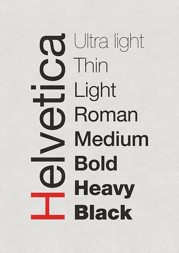
Helvetica is probably the most well known typeface in the world. It was created in 1957 by Max Miedinger and Eduard Hoffmann and became one of the main players during the 60´s and 70´s.
This font has a wide range of variants and is very versatile in the world of design. As we have said, the idea of this post is to introduce you to fonts that are clear and easy to read and Helvetica is a perfect example of this. Probably one of the main reasons it is used so much in the creation of company logos
Even though it is used mainly in titles, its simplicity is what makes it a wildcard for any number of occasions.
2.- Bodoni
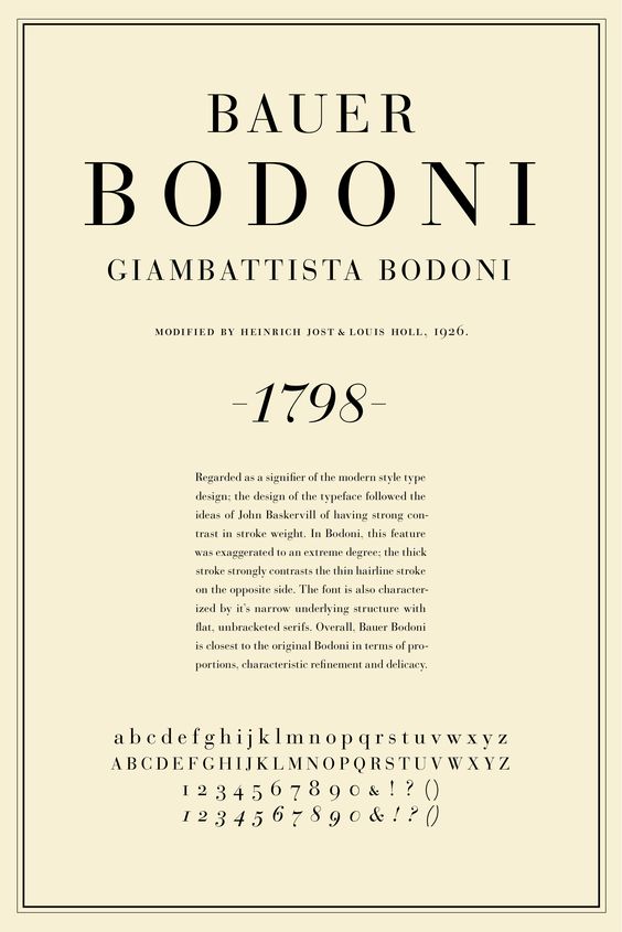
Bodoni is a serif typeface designed by Giambattista Bodoni in 1798. Its creation culminated 300 years of evolution of Roman typography and emerged with great contrasts between thin and thick lines and an overall geometric shape.
Currently, as well as in advertising, this typeface is also used in the press.
3.- Avenir
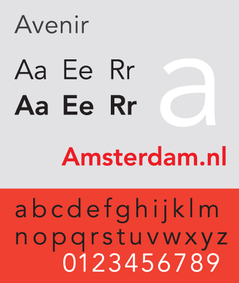
The Avenir is a classic typeface that was designed by Adrian Frutiger in 1988. Frutiger was one of the best-known typographers of the 20th century, and in addition to the Avenir he also created the Univers trypeface.
4.- Univers
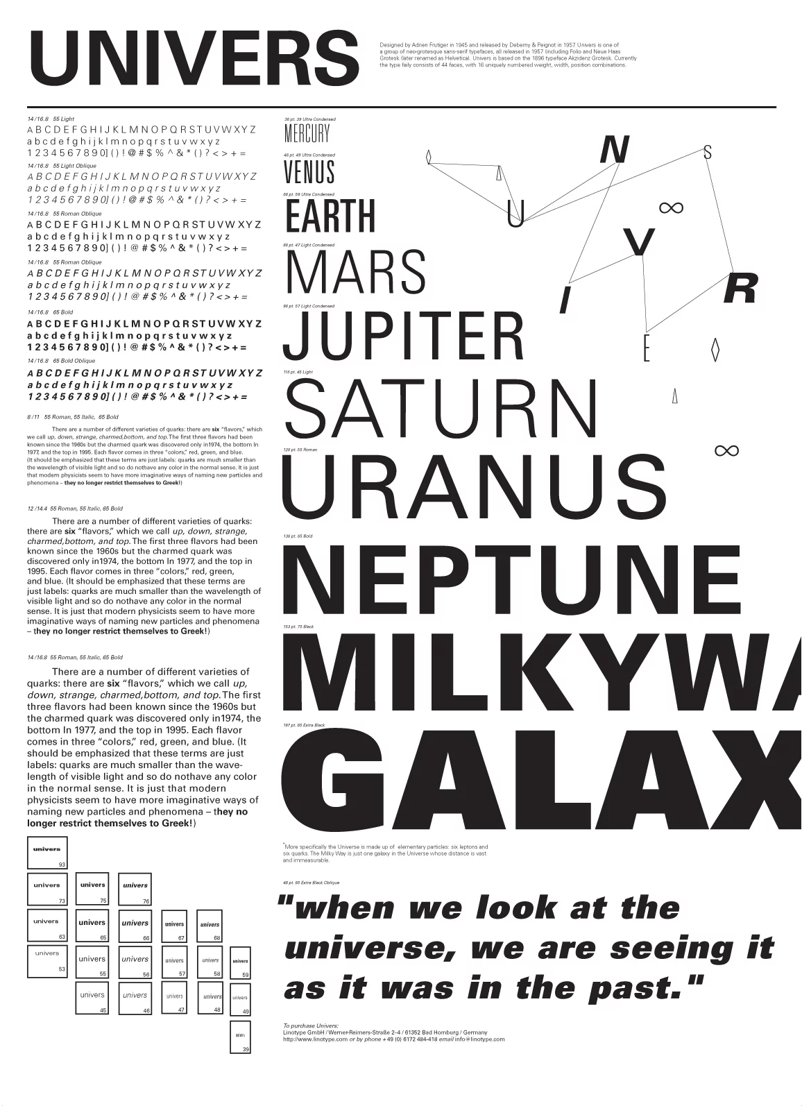
Also designed by Frutiger in 1957, the Univers is one of the most successful typefaces of the second half of the 20th century. So much so that it is one of the most used typefaces in advertising and in the media.
It´s clear, simple and legible and incredibly versatile.
5.- Arial
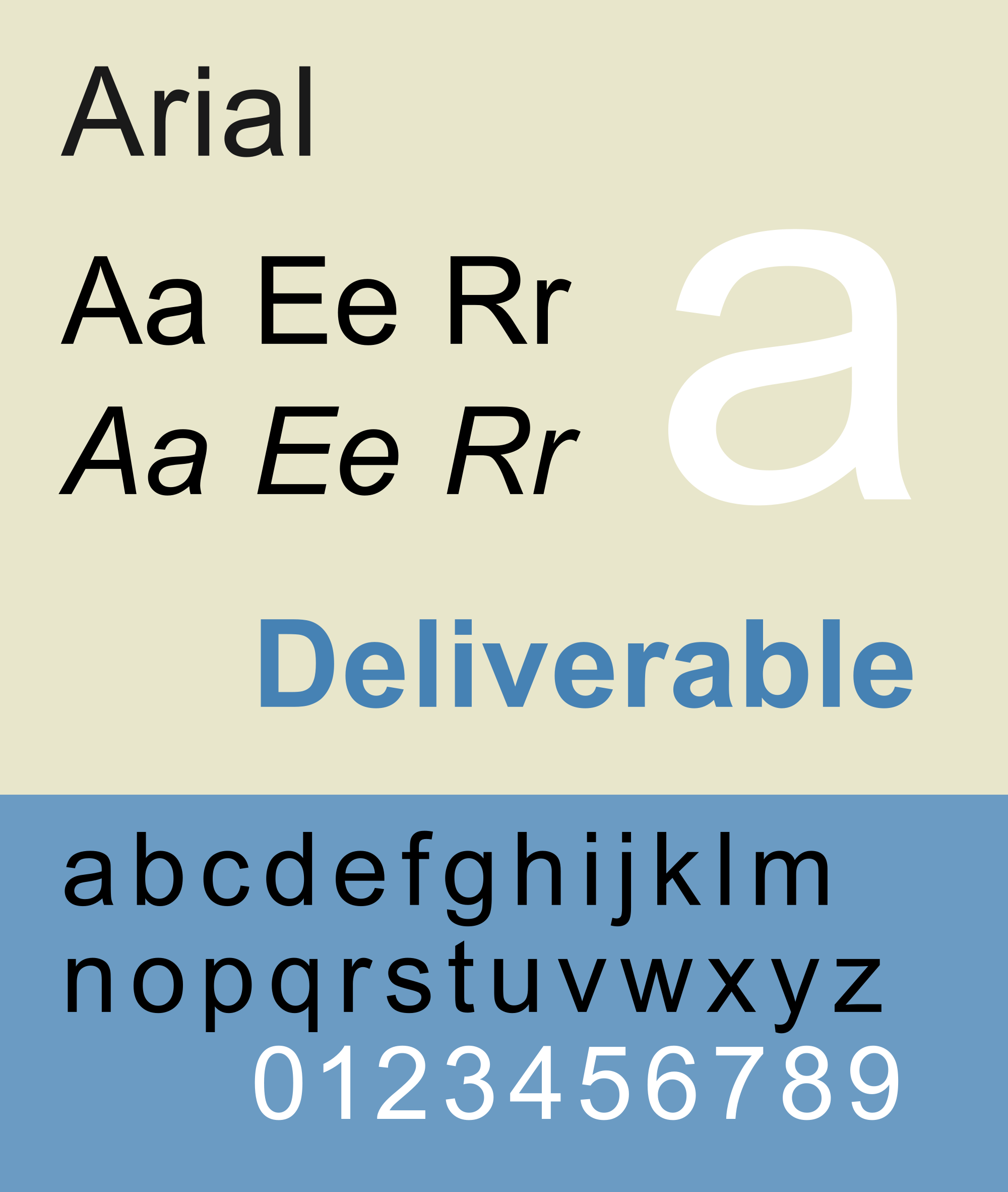
Without doubt it is one of the best known without serif and its completion is a straight, unadorned shape. It really took off after it was included in Windows and over the years it has spread throughout websites and different digital environments.
We recommend using non-serif fonts, as they are easier to read on the screen.
6.- Futura
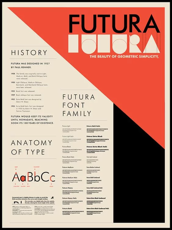
Out of all of the typefaces of the 20th century we come to the most famous, Futura. This font has a very wide variety of bodies ranging from the finest to the thickest.
It was designed by Paul Renner in 1925 and was influenced by Bauhaus. Being a very stylish typeface it is ideal for any form of advertising, posters, magazines and books.
7.- Trajan
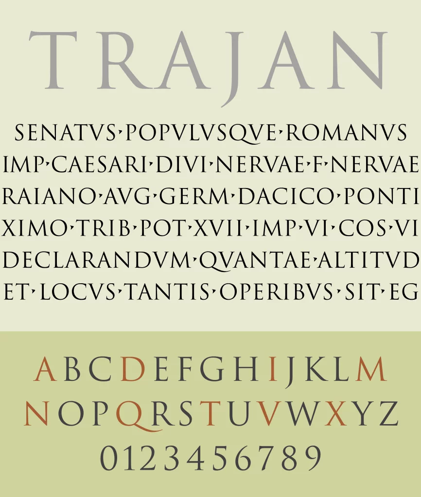
The Trajan font stands out because of it old-fashioned design, which is based on the Roman Square Capital letterforms that were used in the inscriptions at the base of the Trajano columns.
Designed by Carol Twombly, this typeface originally consisted solely of capital letters. However, as the design later evolved new versions were created and in 2001 a set of small capitals were added to this font.
It is a very successful font for use with elegant and select content.
8.- VAG Rounded
It is a geometric sans-serif font, which was designed as a corporate typeface for Volkswagen in 1979 and is currently owned by Adobe.
It is normally used in advertising and is a great choice for logos, although as you can already see, one of the most recognized brands out there already uses this typeface.
9.- Minion
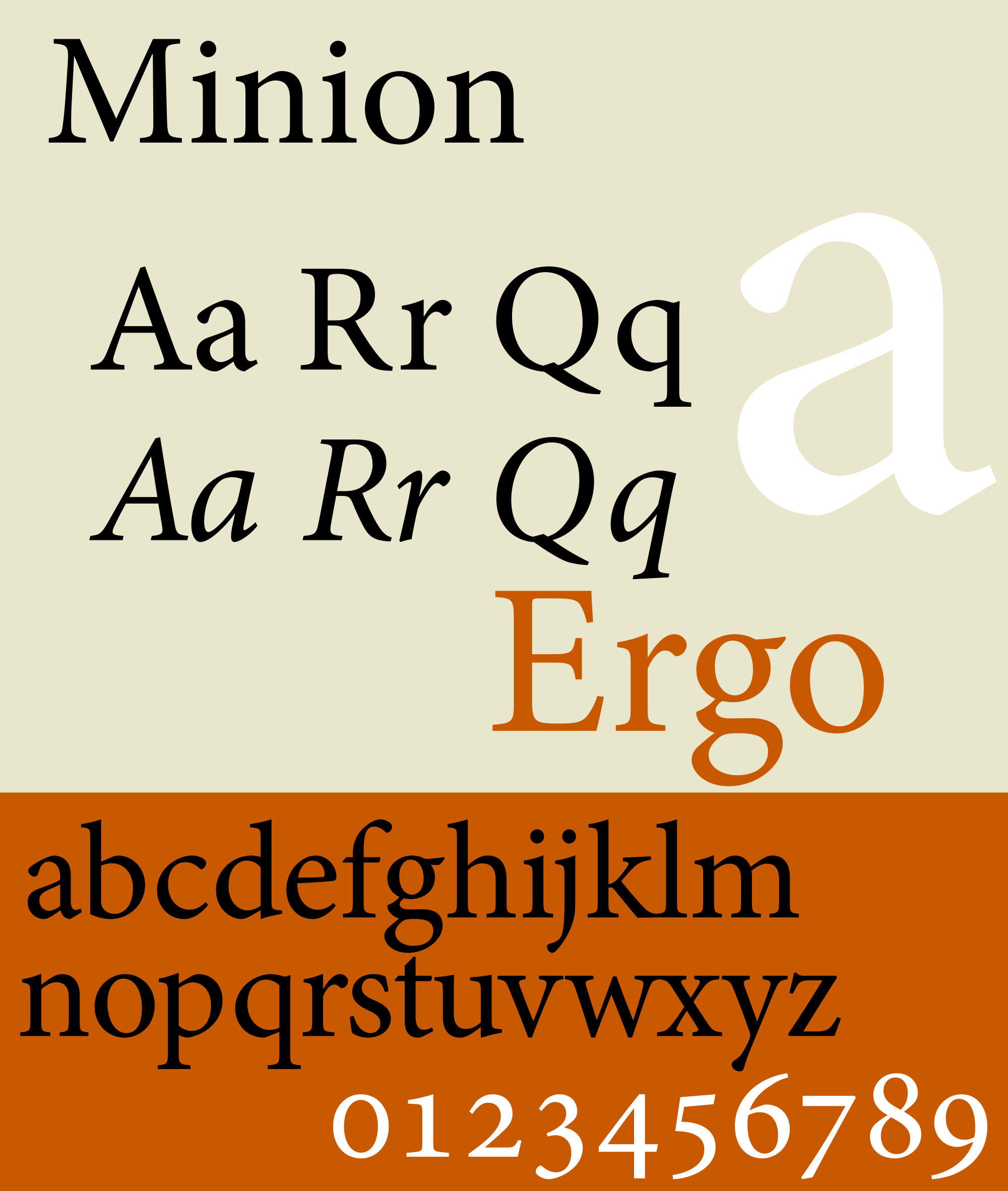
Minion is one of the most used typefaces in advertising and was designed by Robert Slimbach for Adobe Systems in 1990. Thanks to its variety it’s a must when you want to enhance different resources.
10.- Garamond
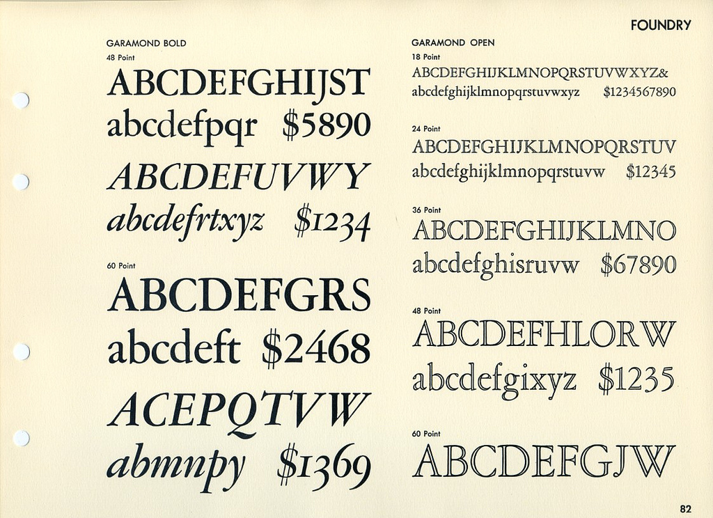
The Frenchman Claude Garamond, who was a printer, designed this typeface after a request from King Francis I of France who commissioned the creation of a typeface with Greek characters in order to publish the work “Alphabetum Graecum”, and so the Garamond was created.
Today it is one of the most used fonts in advertising thanks to a version that was created in 1998. Robert Slimbach was the one who gave it a slight twist and turned it into the elegant letter it is.
11.- Frutiger
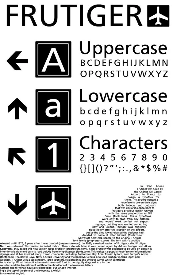
Have you ever stopped to think about the font that is used in airport signs? It’s very recognizable and was first created by Adrian Fruiger for the signs at Charles de Gaulle airport, in Paris. Although it started out as a san serif font later on a serif model was added to the family.
This font is more commonly found on websites and, especially in logos.
12.- Calibri
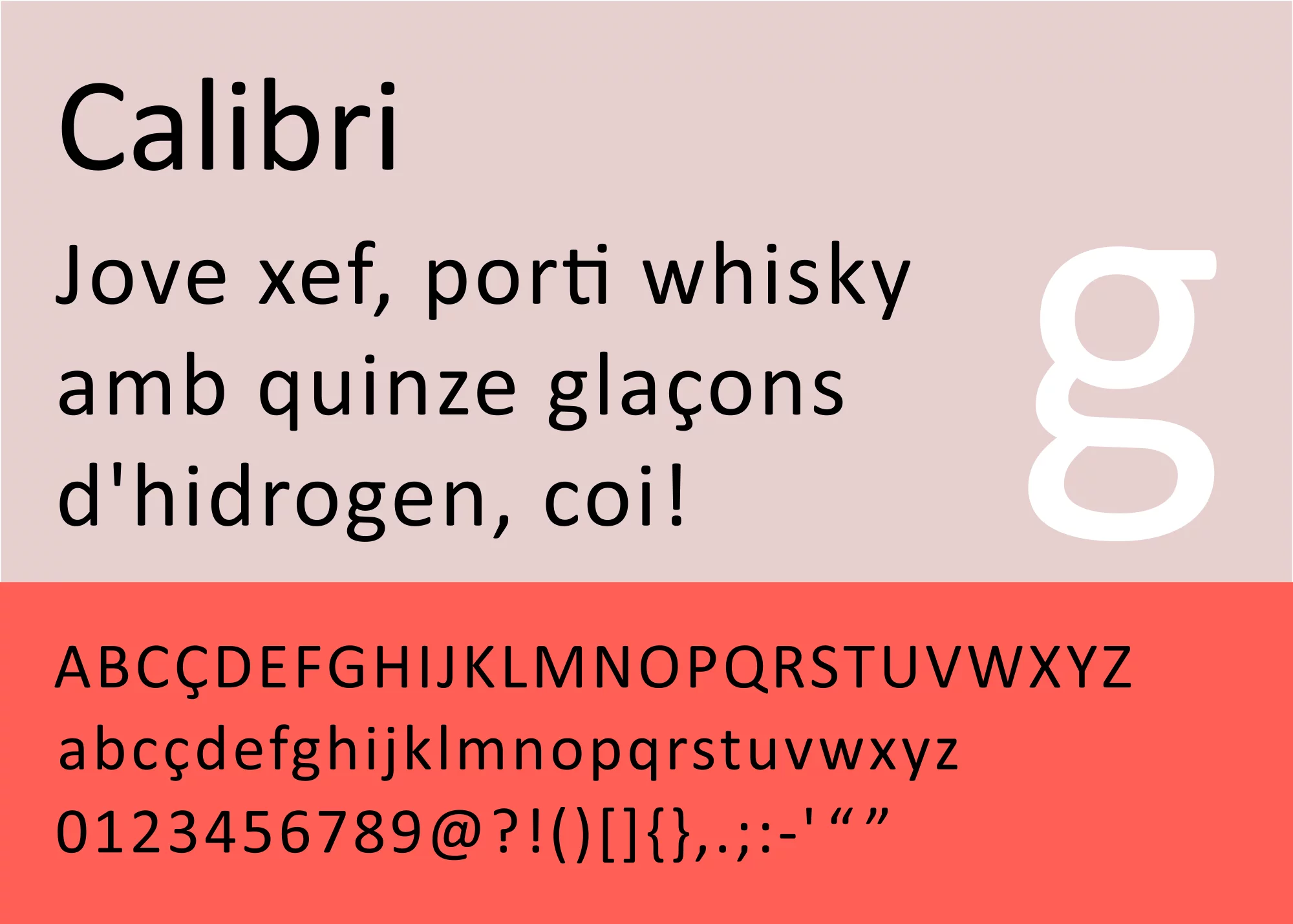
Calibri is one of the preloaded fonts that have come with the Microsoft Office package since 2007 and It replaced both Times New Roman in Word and Arial in PowerPoint, Excel, Outlook and WordPad as the default typeface. It is a san serif typeface because it doesn’t contain a serif which is a small line attached to the end of a stroke in a letter or symbol.
It is used a lot in instant messaging, presentations and emailing.
13.- Meta
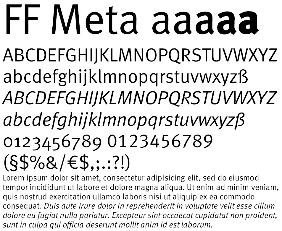
Created by Erik Spiekermann at the end of the 90´s, this font is incredibly flexible and appropriate for all kinds of advertising and is very popular too.
14.- Gill Sans
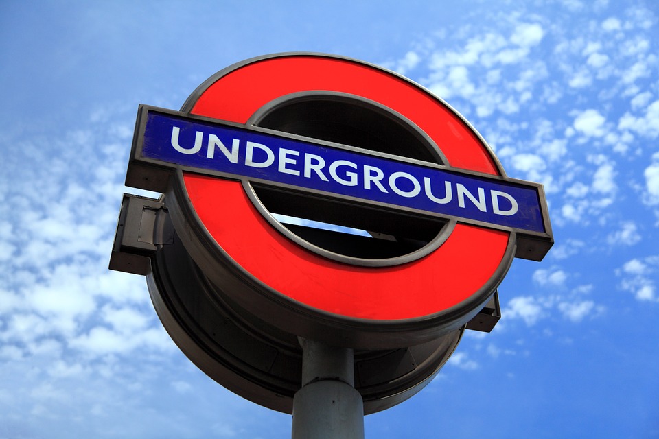
Did you know that Gill Sans is the typeface that is used on the London Underground?
It was created by Eric Gill and published by the Monotype foundation at the beginning of the 20th century and is a very versatile font with many different versions.
15.- Myriad
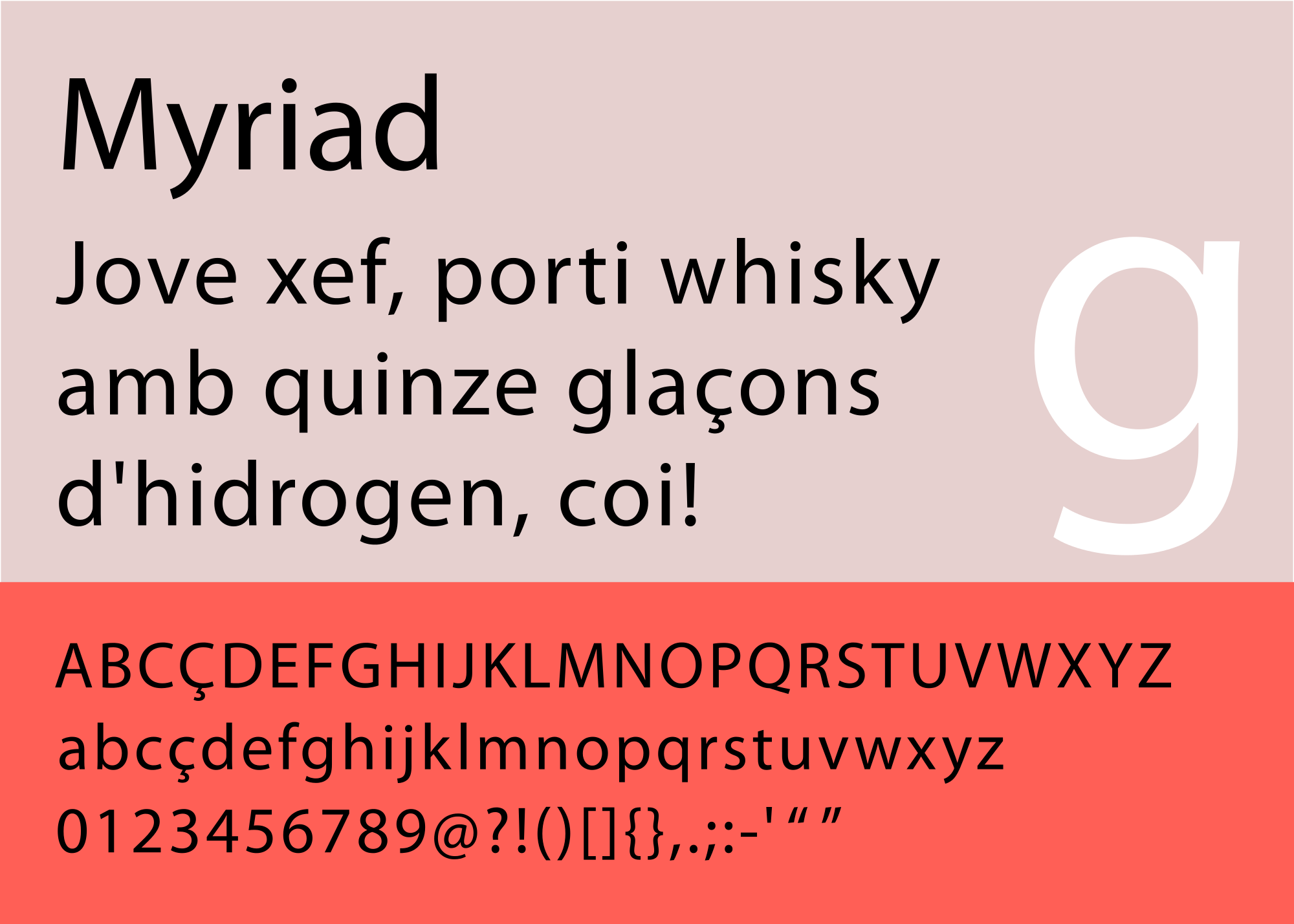
Myriad is a type of sans-serif that was designed by Robert Slimbach and Carol Twombly for Adobe systems, although nowadays it is more commonly recognised as the typeface that has been used by Apple since 2002.
Choosing the right typeface can sometimes be complicated because it can be difficult to know the difference between one font and another. In the case of Myriad we can tell the difference through subtle details like the special descender in the letter “y” and the slanting cut of the letter “e”.
16.- Interstate
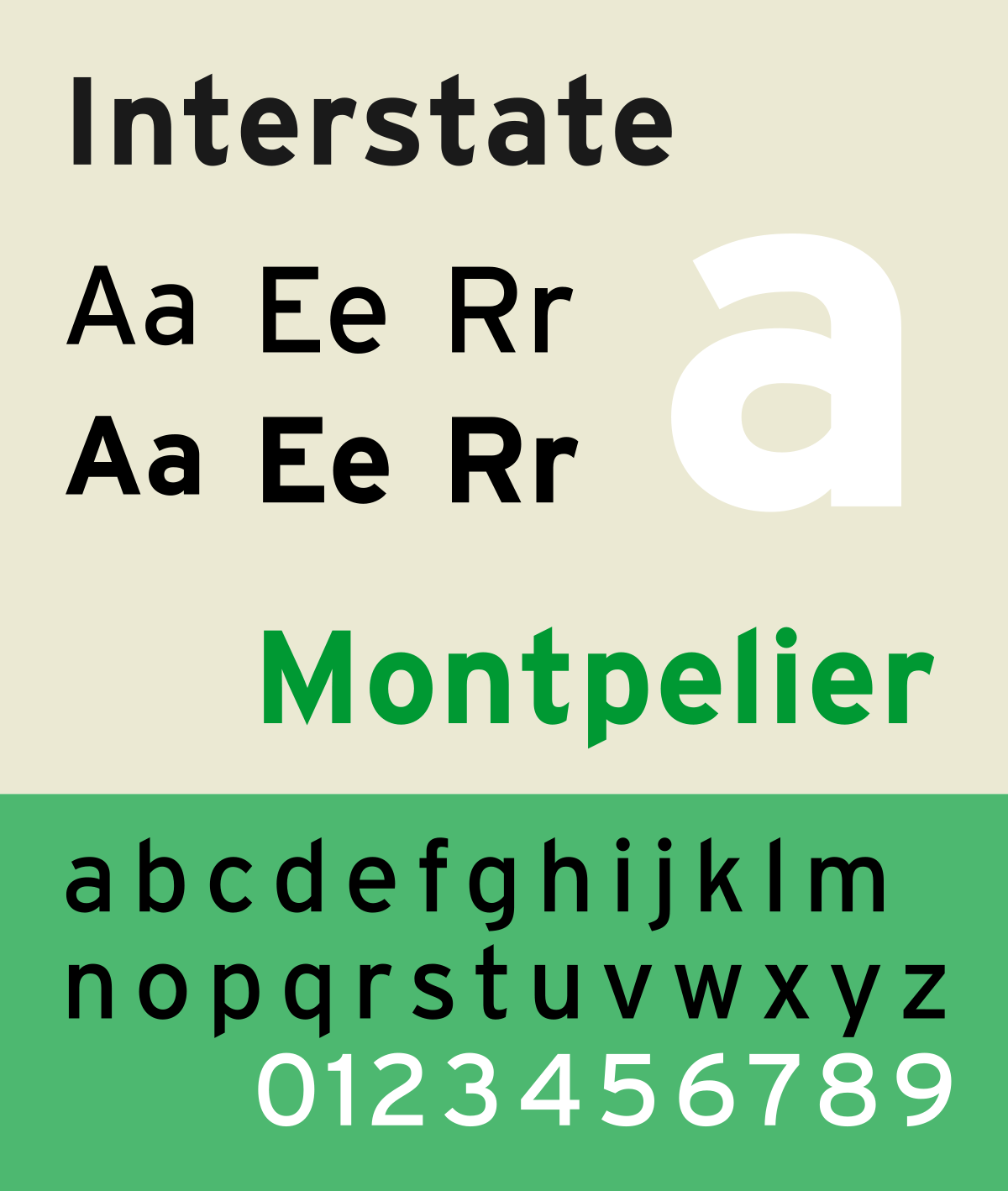
Interstate designed by Tobias Frere-Jones was inspired by the alphabet used on road and highway signs in the United States.
It’s very clear and easy to read that’s why it is used a lot in both magazines and newspapers as well as on websites. It is an excellent choice for bringing your content to life.
17.- Times New Roman
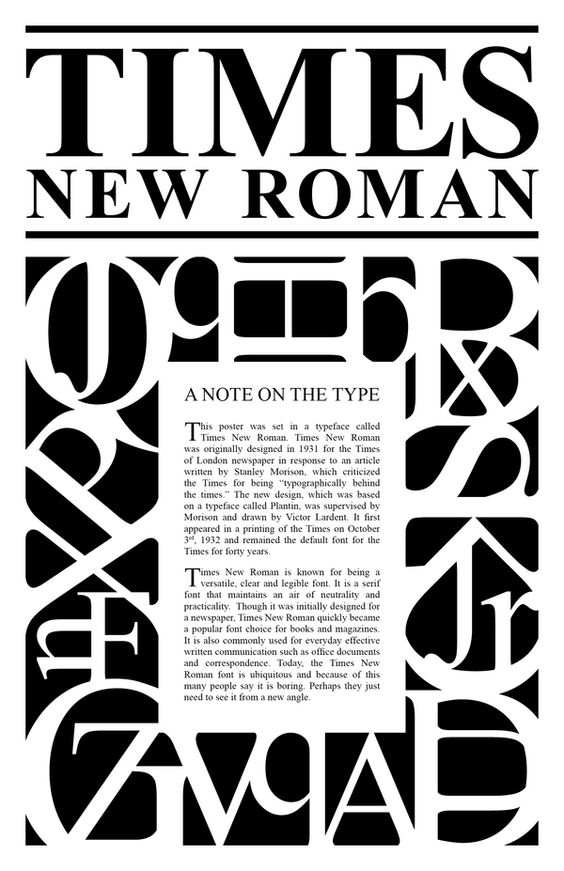
We couldn’t talk about the most used typefaces in advertising without mentioning Time New Roman. It was one of the first fonts to be digitized and its presence can be seen everywhere, whether its in the print media, books or magazines, this typeface works perfectly on paper. So if you are planning on doing any offline advertising like posters or flyers this font is a safe bet.
18.- Clarendon
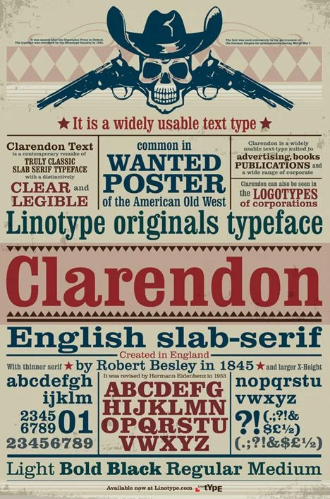
This font was created by Robert Besley in 1845 and is considered the first registered typeface.
Interestingly the Font was not only used in the Wild West on wanted posters but was also used extensively by the German Empire for proclamations during the First World War.
It is a font that can give a lot of personality to your communications; in advertising it is used to give a special touch to any number of content.
19.- Eurostile
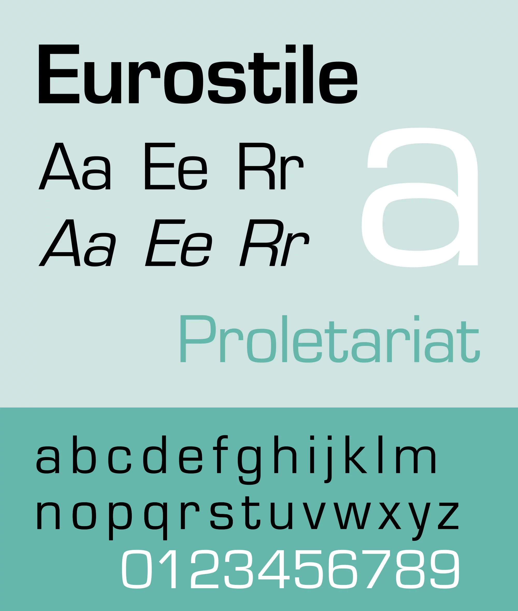
Aldo Novarese and Alexander Butti designed this font in 1952. As you can see from the quadrangular geometric shape of this typeface, it makes it the perfect choice for advertising in the technology sector
20.- Franklin Gothic
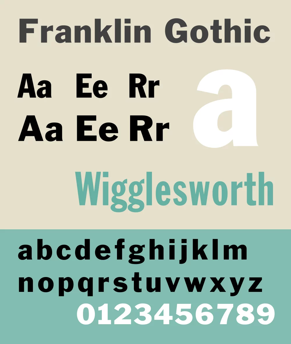
Morris Fuller Benton is the creator of a number of the most well-known and used fonts in advertising today. The Franklin Gothic is widely used in advertising as well as for press headlines and is being used more and more because of its wide range or variants.
21.- Gotham
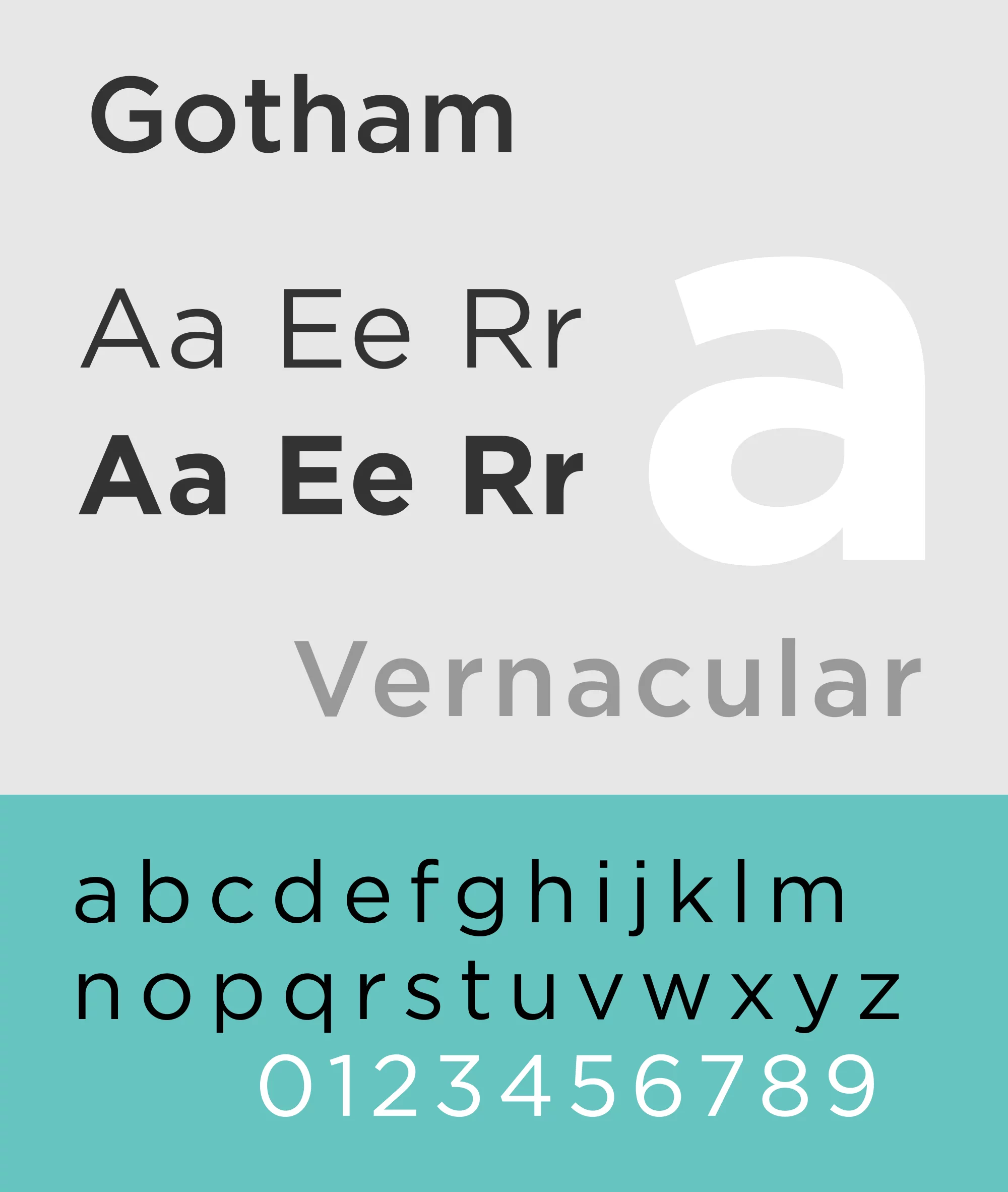
Probably one of the most well known typefaces, in fact it was ranked at number 41 in the top 100 best typefaces by a prestigious German website. Do you know when the Gotham font really took off? When President Obama used it for his political campaign.
22.- DIN
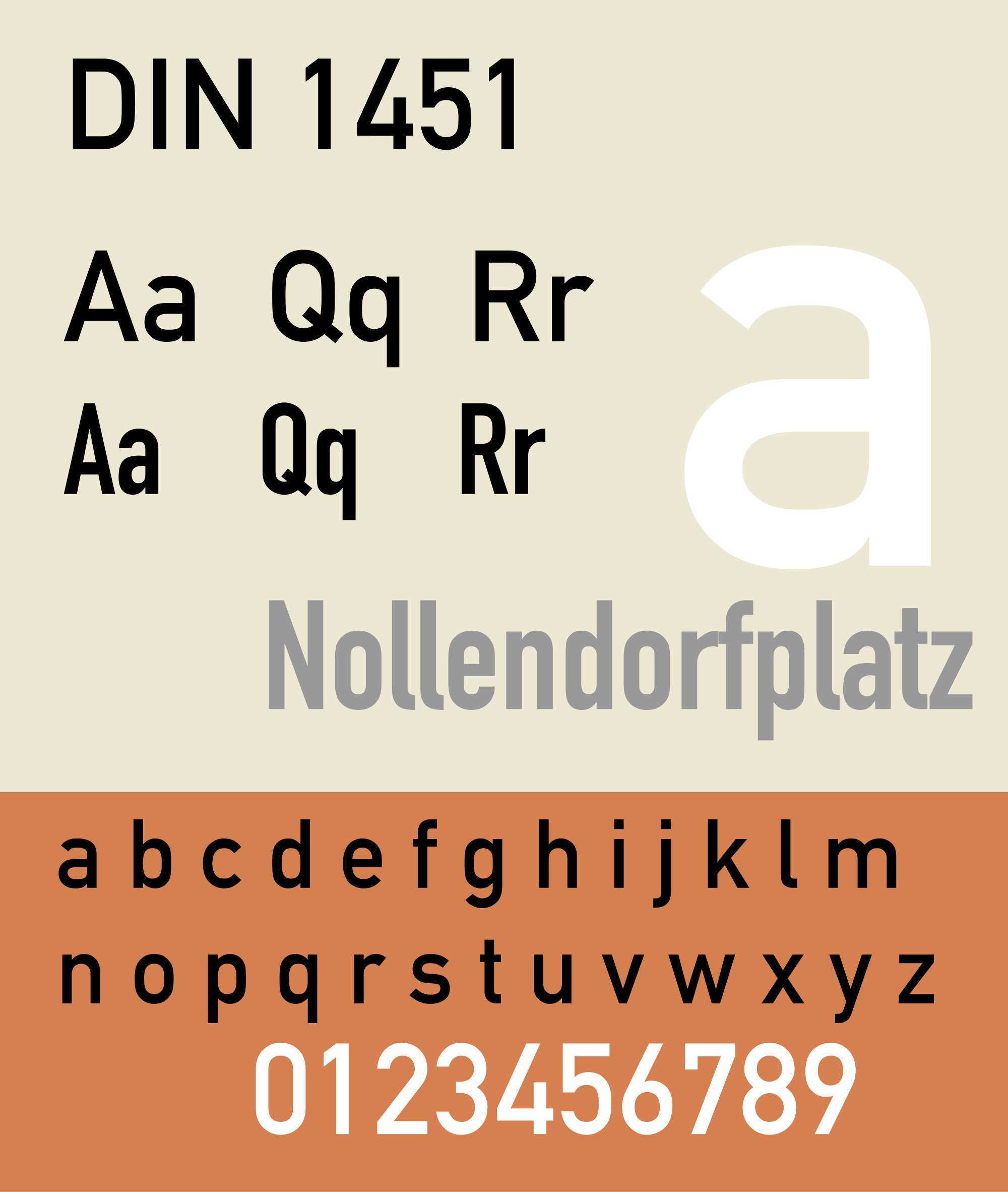
DIN is one of the most recently created typefaces and was designed by the German Albert-Jan Pool in 1995.
It is one of the most frequently used in Advertising, as it happens to be one of the favourite choices for many graphic designers.
23.- Cocon
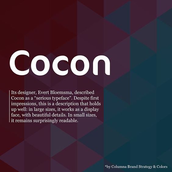
Another of the most recent fonts is the Cocon, which was designed by Evert Bloemsma in 1998.
This typeface is used a lot in advertising, especially in packaging and is thought to have a lot of personality and power.
24.- Avant Garde

Whatever text we see using Avant Garde we instantly think of Adidas, and its not surprising as the brand is responsible for really pushing this typeface which has now become one of the most well known and easily recognisable of all.
The author Heb Lubalin designed this font for Avant Garde Magazine in 1967 and it was later redesigned in collaboration with Tom Carnase, which is when the lowercase letters were added.
25.- Bickham Script
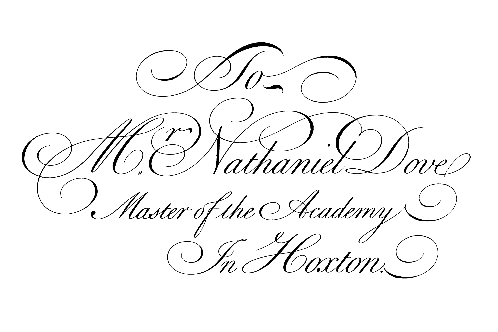
Even though its not one of the most legible fonts, the Bickham Script is frequently used to add special touches to content, especially those that require a more formal and classic style.
Used in certain contexts, this font can be an excellent choice, however it is not recommended for large content as it´s not exactly easy to read. It´s more aesthetic than functional so if you do choose it you have to be very clear that it should only be used on very specific occasions.
As you can see, a wide variety of typefaces exist that you can use to make your web content, blog or Ads really stand out and above all help you to capture leads in your landing pages.
